Many scientific publications use specific styling to add semantics. In converting to XML it’s critical we don’t throw these away at an early stage, yet many common tools discard such styles. #AMI2 does its best to preserve all these and I think is fairly good. There are different reasons for using styles and I give examples from OA publishers…
-
Bold – used extensively for headings and inline structuring. Note (a) the bold for the heading and (b) the start-of-line
-
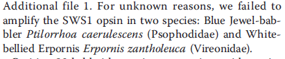
Italic. Species are almost always rendered this way.
-
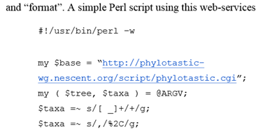
Monospaced.
Most computer code is represented in this (abstract) font.
This should have convinced you that fonts, and styles matter and should be retained. But many PDF2xxx systems discard them, especially for scholarly publications. There’s a clear standard in PDF for indicating bold, for italic and PDFBox gives a clear API for this. But many scholarly PDFs are awful (did I mention this before?). The BMC fonts don’t declare they are bold even though they are. Or italic. So we have to use heuristics. If a BMC font has “+20” after its name it’s probably bold. And +3 means italics.
Isn’t this a fun puzzle?
No. It’s holding science back. Science should be about effective communication. If we are going to use styles rather than proper markup, let’s do it properly. Let’s tell the world it’s bold. Let’s use 65 to mean A.
There are a few cases where an “A” is not an “A”. As in http://en.wikipedia.org/wiki/Mathematical_Alphanumeric_Symbols
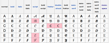
Most of these have specific mathematical meanings and uses and most have their own Unicode points. They are not letters in the normal sense of the word – they are symbols. And if they are well created and standard then they are mangeable
But now an unnecessary nuisance from PeerJ (and I’m only using Open Access publishers so I don’t get sued):
What are the blue things? They look like normal characters, but they aren’t:
<text fill=”#00a6fc” svgx:fontName=”MinionExp-Regular” svgx:width=”299.0″
x=”284.784″ y=”162.408″ font-weight=”normal”></text>
<text fill=”#00a6fc” svgx:fontName=”MinionExp-Regular” svgx:width=”299.0″
x=”281.486″ y=”162.408″ font-weight=”normal”></text>
They are weird codepoints, outside the Unicode range:
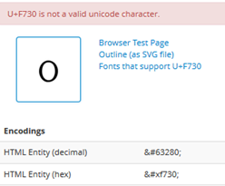
These two seem to be small-capital “1” and “0”. They aren’t even valid Unicode characters. Some of our browsers won’t display them:
(Note the missing characters).
Now the DOI is for many people a critically important part of the paper! It’s critical that it is correct and re-usable. But PeerJ (which is a modern publisher and tells us how it has used modern methods to do publishing better and cheaper) seems to have deliberately used totally non-standard characters for DOIs to the extent that my browser can’t even display them. I’m open to correction – but this is barmy. (The raw PDF paper displays in Firefox, but that’s because the font is represented by glyphs rather than codepoints.) No doubt I’ll be told that it’s more important to have beautiful fonts to reduce eyestrains for humans and that corruption doesn’t matter. Most readers don’t even read the references – they simply cut and paste them.
So let’s look at the references:
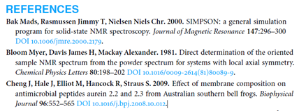
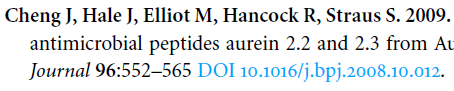
Here the various components are represented in different fonts and styles. (Of course it would be better to use approaches such as BibJSON and even BibTeX, but that would make it too easy to get it right). So here we have to use fonts and styles to guess what the various bits mean. Bold are the authors, Followed by a period. And bold number for the year. And a title in normal font. A Journal in italics. More Bold for the volume number. Normal for the pages. Light blue is DOI.
But at least if we keep the styles then #AMI2 can hack it. Throwing away the styles makes it much harder and much more error prone.
So to summarise #AMI2=PDF2SVG does things that most other systems don’t do:
- Manages non-standard fonts (but with human labour)
- Manages styles
- Converts to Unicode
AMI2 can’t yet manage raw glyphs, but she will in due time.(Unless YOU wish to volunteer – it actually is a fun machine-learning project).
NOTE: If you are a large commercial publisher then your fonts are just as bad.