AMI and Friends (Murray Jensen, PMR) have made good progress with the first part of their 3-part Quest. PDF2SVG is now at continual-beta. The framework is in place, moderately exercised and “tested”. (It’s actually quite difficult to build tests for systems that have no fixed spec, but at least there are some sort of regression tests). It’s at http://www.bitbucket.org/petermr/pdf2svg
Running PDF2SVG should be easy. You need to have Java 1.6 installed. There’s a giant JAR file (pdf2svg-4-jar-with-dependencies.jar or later) which can be run on the commandline by:
$ java –jar pdf2svg-4-jar-with-dependencies.jar [myfile.pdf]
[If you don’t know what this is about and still want to run AMI, find the nearest person with a penguin on their T-shirt and ask very nicely. If you don’t know what a commandline is, suggest you leave it…]. [Jar will be uploaded today]. This takes the PDF file, reads about 5 pages per second (on my laptop) and creates a *.svg file for each page. Thus if the PDF had 10 pages you should have something like:
myfile1.svg, myfile2.svg … myfile10.svg
This is already somewhat magical. AMI has converted the impenetrable PDF file into much more penetrable SVG files. [Hang on – it’s worth it.]. SVG files can be read by geeks and are an infinitely better starting point for phases 2 and 3 of AMI’s quest. Indeed if you like things like Crosswords and Sudoku you’ll find it’s quite simple. If AMI has done a complete job then there should be only 3 sorts of things in these SVG files:
- Characters (letters, numbers) positioned on the page
- Paths (lines, curves, squiggles( positioned on the page).
- Images (at present AMI leaves these out but they can go back at any time
There are no words, paragraphs, squares, graphs, chemical formulae at this stage because we haven’t taught AMI about them. (But we will and she can learn them quickly). The magic is that every object is precisely defined – e.g. what the character is, etc.
Now the slightly bad news. It’s possible to create excellent PDF files which translate trivially into SVG. AMI does this translation perfectly. The trouble is that STM publishers create PDF files of “varying” quality. The top quality is “barely satisfactory” and most are harder to work with.
There is an Open PDF specification which allows all characters to be created as Unicode and all graphics to be captured as Vector Graphics. But many publishers will transform the vector graphics (from which AMI can get a lot) into JPEGs (from which AMI can recover almost nothing). And many of the characters are transformed into Glyphs.
What’s a Glyph? It’s a pictorial diagram which represents a character (sometimes more than one character – a “ligature”). Publishers assume that all “readers” will be sighted humans and that a collection of dumb glyphs is satisfactory.
It isn’t.
An unsighted human cannot understand a glyph and nor (easily) can AMI. What’s this character: “I”? Is it a CAPITAL_LATIN_I or a SMALL_LATIN_L? You *cannot* tell by looking at it. What’s this: “III”? ILL, or Roman-THREE? If the values (codepoints) of the characters are given then we know absolutely. Without those codepoints we have to guess from the Glyph. (This is one of the problems of Optical Character Recognition – sometimes you cannot know for sure). What’s “-“? MINUS, HYPHEN-MINUS, EM_DASH, EN_DASH, OVERBAR, UNDERBAR, etc.
If all publishers used Unicode and standard PDF fonts we would be fine. But they don’t. They choose unknown, undocumented Fonts and also throw away significant amounts of information. In other cases the information is visibly inconsistent. We find a character whose name is “bullet” and whose glyph is “-“. What is it? We have to guess.
AMI is being taught to guess. Not by tossing a dice but by following a set of heuristic rules. And, where necessary, adding probabilities. So here is one of the most problematic she has encountered. [Remember AMI does not rant; she has no emotions. Things can be difficult or easy; valid or invalid; probably correct and probably incorrect.]
So first to show you what AMI can do with good material. This is from the Australian Journal Of Chemistry, from CSIRO Publishing. In general it’s manageable quality. Here’s the PDF:
And here’s AMI’s transformation into SVG:
Can you spot any differences (other than the boxes and red highlighting AMI has drawn in (for reasons we’ll see in later posts)? PMR can’t. All the characters are there and in the right places. The italics are detected and so are the bolds. There’s only one thing we had to teach AMI to get this right (see later).
But here’s an equation AMI thinks is probably wrong:
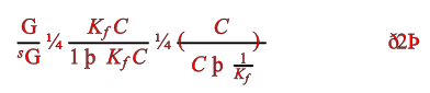
OK – most trained sighted scientists will probably spot something strange immediately. But AMI isn’t sighted and isn’t a scientist and doesn’t understand equations (not yet; but she will!). So why does she think it’s probably wrong?
Because of the characters. Nobody uses the single character ¼ (a quarter). It is (sometimes) used for farthings, imperial lengths, stock prices etc. But never in scientific documents. And then there are “eth” and “thorn”. How many scientific articles are written in Icelandic? And even those wouldn’t make linguistic sense. So there is a VERY high probability that these characters have been misinterpreted.
This is actually from a paper where most of the information is presented in glyphs, where no fonts are standard and where character names have been discarded. It’s almost certainly unintelligible to a non-sighted human. So what did the original equation look like?
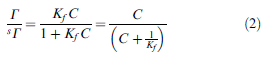
You’ll see that the “G” should be a Capital Italic Gamma, the ¼ should be an “=” and there are two types of thorn (lowercase and uppercase). One represents a “+” and the other eth-Thorn is matching rounded parentheses.
It’s not AMI’s fault. It’s because the publisher gave incomplete information. Let’s see what is actually underneath. Today we gave AMI a tooltip so sighted humans can browse each character and debug AMI. That’s very useful:
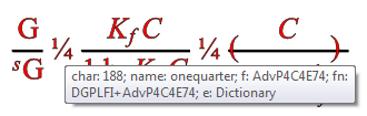
So the tooltip says that the ¼ is codepoint 188 in Font AdvP4C4E74. The problem is AMI has never heard of this font. Nor has PMR and I suspect nor have most other people. It’s not documented. So how do we progress? We could write to the publisher who probably won’t reply and then will tell us they don’t know or it’s confidential or … So we’ll have to develop some heuristics. It may be that we simply have to say “This paper is written in an uninterpretable manner for non-sighted humans” but we hope we can do more.
Note that there are actually several fonts:
- The “G” is “AdvPi2”
- The “¼” and the eth-T/thorns are “AdvP4C4E74”
- The “KfC” is “AdvTimes-i” (italic)
- The “1” is AdvTimes
- The (…) pair are “AdvP4C4E46”
[That’s 5 fonts used in 4 cm of text. If the publisher had used Unicode it could have been done with one (with appropriate font-sizes and italics). ]
This equation is probably beyond even AMI’s powers at present, but who knows. More experience and crowdsourcing will add greatly. We will have rules like “You can/can’t rely on publisher X for consistency or validity” (and we’ll start to publish examples of quality).
So here’s what PDF2SVG produces for the AJC paper (just one page for brevity, though AMI does 130 pages in ca 20 secs).
name=TimesNewRomanPS fam=TimesNewRoman type=Type1 bold=false it=false face=PS sym=false enc=WinAnsiEncoding
Excellent start by AJC. TimesNewRoman is a standard Type1Font in PDF and should map onto Unicode. It uses WinAnsi encoding which is standard and AMI has been taught about.
name=KAIHCK+Helvetica fam=Helvetica type=Type1 bold=false it=false face=null sym=false enc=WinAnsiEncoding
Again Helvetica is a standard Type1Font.
name=KAIKCD+Helvetica-Oblique fam=Helvetica type=Type1 bold=false it=true face=null sym=false enc=WinAnsiEncoding
name=TimesNewRomanPS-Bold fam=TimesNewRoman type=Type1 bold=true it=false face=null sym=false enc=WinAnsiEncoding
And these are fine as well (the publisher has recorded that the first is italic and the second is bold). This is encoded in the PDF (We should not have to guess it from the font names. Again excellent so far.
name=KAILAO+MathematicalPi-One fam=MathematicalPi-One type=Type1 bold=false it=false face=null sym=true enc=DictionaryEncoding
This is a problem. MathematicalPi (there are at least -One, -Two, -Three, -Four) is a non-standard font. It’s not documented anywhere PMR can find. (PMR has even offered a bounty of 200 points on StackOverflow for a conversion to Unicode).
MathematicalPi does not have numeric codepoints. It has charnames. The one we need is “H11001”. How do we know what that is? (or even that it’s consistent – PMR believes it is). There are two main ways:
-
Ask humans what they think the glyph means (now go back to the first diagram and find
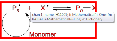
Most sighted humans would be happy to say this is a “PLUS SIGN”
-
Interpret the glyph without human eyes. So here’s the information (M = moveto, L = lineto, Z = close). If you plot this out on graph paper you’ll see a plus
H11001: created M 0.390625 -0.03125 L 0.390625 -0.296875 L 0.125 -0.296875 L 0.125 -0.34375 L 0.390625 -0.34375 L 0.390625 -0.625 L 0.4375 -0.625 L 0.4375 -0.34375 L 0.71875 -0.34375 L 0.71875 -0.296875 L 0.4375 -0.296875 L 0.4375 -0.03125 Z
But AMI has to do this without eyes. It *is* possible, but we’d also be very interested in offers of help or code.
So this is a problem. A non-standard (probably) proprietary font makes it much more difficult. It gets more problematic still:
name=MTSYN fam=MTSYN type=Type1 bold=false it=false face=null sym=true enc=DictionaryEncoding
null: created M 0.703125 -0.21875 L 0.078125 -0.21875 L 0.078125 -0.28125 L 0.703125 -0.28125 Z
This is harder as we have a non-standard font and no charname. We have a glyph and a codepoint. What does it look like?
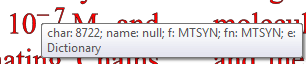
So it’s a MINUS SIGN (U+2212) . The characters before and after are Times which has a perfectly good HYPHEN-MINUS but for some reason the publisher has chosen a non-standard font. With no public documentation. At least it appears to be Unicode.
name=MTMI fam=MTMI type=Type1 bold=false it=true face=null sym=true enc=DictionaryEncoding
slash: created M 0.421875 -0.671875 L 0.09375 0.203125 L 0.046875 0.203125 L 0.375 -0.671875 Z
Yet another non-standard font (for encoding a standard Unicode character SOLIDUS).
And still another:
name=MTEX fam=MTEX type=Type1 bold=false it=false face=null sym=true enc=DictionaryEncoding
null: created M 0.515625 0.46875 L 0.171875 0.921875 L 0.703125 0.921875 C 0.859375 0.921875 0.921875 0.859375 0.953125 0.78125 L 0.984375 0.78125 L 0.90625 1.0 L 0.0625 1.0 L 0.421875 0.515625 L 0.0625 0.0 L 0.90625 0.0 L 0.984375 0.21875 L 0.953125 0.21875 C 0.90625 0.0625 0.796875 0.046875 0.703125 0.046875 L 0.21875 0.046875 Z
I’ll leave it to you to find out what this one is!
So this AJC page started out conformant and then got more and more non-standard and so more difficult and error-prone. Many other publishers are more “variable”. Remember AMI2 has no emotions and no idea of the size of the task ahead. She just solves one problem at a time.
So find a PDF you are interested in and see how well it works for you. You’ll almost certainly find strange characters and we ‘ll be hoping to collect communal wisdom. What’s more important at this stage is reports of crashes or hanging. Let us know.
>> And still another:
>>
>> name=MTEX fam=MTEX type=Type1 bold=false it=false face=null sym=true enc=DictionaryEncoding
>>
>> null: created M 0.515625 0.46875 L 0.171875 0.921875 L 0.703125 0.921875 C 0.859375 0.921875 0.921875 0.859375 0.953125 0.78125 L 0.984375 0.78125 L 0.90625 1.0 L 0.0625 1.0 L 0.421875 0.515625 L 0.0625 0.0 L 0.90625 0.0 L 0.984375 0.21875 L 0.953125 0.21875 C 0.90625 0.0625 0.796875 0.046875 0.703125 0.046875 L 0.21875 0.046875 Z
>>
>> I’ll leave it to you to find out what this one is!
That’s upper-case greek sigma! The above path specification makes use of an undocumented command “C” (two times), which should be read as “curve to”.
>> But AMI has to do this without eyes. It *is* possible, but we’d also be very interested in offers of help or code.
Bounty?
>>
>> null: created M 0.515625 0.46875 L 0.171875 0.921875 L 0.703125 0.921875 C 0.859375 0.921875 0.921875 0.859375 0.953125 0.78125 L 0.984375 0.78125 L 0.90625 1.0 L 0.0625 1.0 L 0.421875 0.515625 L 0.0625 0.0 L 0.90625 0.0 L 0.984375 0.21875 L 0.953125 0.21875 C 0.90625 0.0625 0.796875 0.046875 0.703125 0.046875 L 0.21875 0.046875 Z
>>
>> I’ll leave it to you to find out what this one is!
>>>>That’s upper-case greek sigma!
Well done!
>>The above path specification makes use of an undocumented command “C” (two times), which should be read as “curve to”.
OK – *I* didn’t document it but it’s part of SVG – http://www.w3.org/TR/SVG/paths.html#PathDataCubicBezierCommands
>>>> But AMI has to do this without eyes. It *is* possible, but we’d also be very interested in offers of help or code.
>>Bounty?
Do you mean StackOverflow bounty? Not really appropriate. [My latest bounty hasn’t been answered.]
This is more at the stage where any general strategic advice is really valuable. People should volunteer if the really want to , not because I put pressure on them.
It would probably make sense to start a new sub-project (under the PDF2SVG project) that would directly address the topic of the “visual identification” of glyphs.
I suppose that the first activity should be to collect a representative sample of embedded font objects. This can be done by scanning through all available PDF documents, identifying and extracting all their embedded font objects, and storing them as (binary-) files in some kind of shared resources directory.
Anyway, does the current copyright and licensing model of PDF documents allow such activity?
>>It would probably make sense to start a new sub-project (under the PDF2SVG project) that would directly address the topic of the “visual identification” of glyphs.
Good idea!
>>I suppose that the first activity should be to collect a representative sample of embedded font objects. This can be done by scanning through all available PDF documents, identifying and extracting all their embedded font objects, and storing them as (binary-) files in some kind of shared resources directory.
We are doing quite a lot of this. I am tabulating all the fontNames in a document and trying to work out what the encoding it. Haven’t gone as far as saving the fonts
>> Anyway, does the current copyright and licensing model of PDF documents allow such activity?
Don’t know. It’s a good reason for not storing the fonts verbatim. What I would intend to store is some commentary including names, and tools for analysing outline fonts. Whether these tools are illegal under the DCMI or whatever I have no idea. I generally ask for forgiveness not permission. And if someone wants their font taken down, fine. We can compare fonts against public bitmaps/outlines (e.g. from Java)
Pingback: yet another #solo12 recap (part 1) - Ross Mounce