AMI2 is our new intelligent amanuensis for reading and understanding the Scientific Technical Medical literature. AMI is OURS – not mine – she is completely Open and you can take part.
YOU DON’T HAVE TO KNOW COMPUTING TO HELP.
AMI’s first phase (PDF2SVG) is ready for work. It’s alpha. That means that no-one has tested it yet. It also means you shouldn’t rely on the results. Indeed you would be very foolish to – we have detected an instance today where a string is printed as

And AMI interprets it as “mg”
That’s very very bad. The first is a microgram (1 millionth of a gram) and the second is a milligram (1 thousandth) of a gram. If you have a dose of (say) 1 micrograms and it is converted to 1 milligram you get 1000 too much. That could easily kill you.
So what’s the problem? After all AMI is smart and once taught something she never forgets.
The main problem is Fonts. Badly constructed and badly/un documented. An indication of the enormous diversity and (often poor practices) in the production of STM PDFs. AMI has to cope with all of this, as competently as possible. This is AMI’s blog post so there are no [PMR] rants. AMI has no emotions (that’s an exciting part of machine intelligence but far beyond PMR and AMI.) If AMI is given a job, she carries it out deterministically. Like a wage slave, but she doesn’t get paid, never gets hungry of tired. So here is how AMI has been instructed in what Fonts are and how to understand them.
Note that the terminology, like so much else in PDF production is misused. Some of the concepts we label in PDFspeak have better names. And please correct me when I am wrong! For example “Helvetica” formally refers to a typeface but the word “Font” is misused instead. Similarly we should use FontFoundry in some instances. “PDF Font” would probably be a precise name, and in the software we are using (PDFBox) there is a class PDFont to represent this.
The terminology and concepts date from about 150 years ago where the purpose of fonts was to create physical metal objects (“type”) which were used to print ink onto paper. Never forget that the printing of ink onto paper perfuses the language and thinking of digital typography. We have to change that. Here’s http://en.wikipedia.org/wiki/Font :
In typography, a font is traditionally defined as a quantity of sorts composing a complete character set of a single size and style of a particular typeface. For example, the complete set of all the characters for “9-point
Bulmer” is called a font, and the “10-point Bulmer” would be another separate font, but part of the same font family, whereas “9-point Bulmer boldface” would be another font in a different font family of the same typeface. One individual font character might be referred to as a “sort,” “piece of font,” or “piece of type”.
Font nowadays is frequently used synonymously with the term typeface, although they had clearly understood different meanings before the advent of digital typography and desktop publishing.
Beginning in the 1980s, with the introduction of computer fonts, a broader definition for the term “font” evolved. Different sizes of a single style—separate fonts in metal type—are now generated from a single computer font, because vector shapes can be scaled freely. “Bulmer”, the typeface, may include the fonts “Bulmer roman”, “Bulmer italic”, “Bulmer bold” and “Bulmer extended”, but there is no separate font for “9-point Bulmer italic” as opposed to “10-point Bulmer italic”.
So computer font technology has evolved (slightly) to make it possible to normalize some of the process of putting digital ink on digital display (either “screen” or “printer”). Never forget that it is assumed that a sighted human is “reading” the output. The output is a two dimensional object representing paper with marks on it.
Without a human sighted reader almost all the value of PDFs is lost. That’s what AMI is tackling. We are building http://en.wikipedia.org/wiki/Computer_font into her brain. If you and AMI are to underatnd each other you must understand this:
A computer font (or font) is an electronic data file containing a set of glyphs, characters, or symbols such as dingbats. Although the term font first referred to a set of metal type sorts in one style and size, since the 1990s it is generally used to refer to a scalable set of digital shapes that may be printed at many different sizes.
There are three basic kinds of computer font file data formats:
- Bitmap fonts consist of a matrix of dots or pixels representing the image of each glyph in each face and size.
- Outline fonts (also called vector fonts) use Bézier curves, drawing instructions and mathematical formulae to describe each glyph, which make the character outlines scalable to any size.
- Stroke fonts use a series of specified lines and additional information to define the profile, or size and shape of the line in a specific face, which together describe the appearance of the glyph.
Bitmap fonts are faster and easier to use in computer code, but non-scalable, requiring a separate font for each size. Outline and stroke fonts can be resized using a single font and substituting different measurements for components of each glyph, but are somewhat more complicated to render on screen than bitmap fonts, as they require additional computer code to render the outline to a bitmap for display on screen or in print. Although all types are still in use, most fonts seen and used on computers are outline fonts.
A raster image can be displayed in a different size only with some distortion, but renders quickly; outline or stroke image formats are resizable but take more time to render as pixels must be drawn from scratch each time they are displayed.
Fonts are designed and created using font editors. Fonts specifically designed for the computer screen and not printing are known as screenfonts.
Fonts can be monospaced (i.e., every character is plotted a constant distance from the previous character that it is next to, while drawing) or proportional (each character has its own width). However, the particular font-handling application can affect the spacing, particularly when doing justification.
You really have to understand this if you are going to help build and make the best use of AMI2.PDF2SVG. On the other hand if you just want to use the output of PDF2SVG you should trust us to get it (mainly) right and then it becomes much simpler
Some of the problem arises from the technical constraints in – say – the 1980’s. Screens (e.g. Tektronix) were often not interoperable and graphics vector drawers (e.g. Calcomp) were expensive and had arcane drivers. Speed and bandwidth were also critical and we saw protocols such as http://en.wikipedia.org/wiki/Ascii85 which added slight compression at the cost of almost complete uninterpretability. Unfortunately some of this culture remains in vestigial mode.
Much of the problem arises from the closed and fragmented nature of the digital printing industry. Companies built systems where there was a ?complete proprietary toolchain from a single supplier. As long as you used this supplier throughout there was a reasonably chance the operation would produce paper with ink meaningful to humans. Major manufacturers (such as Adobe, Apple and Microsoft) created non-interoperable systems. Each would create non-interoperable codepoint maps (we’ll explain codepoint later) and additional such as symbol tables. So the only thing you could do is buy a compatible printer and print the document.
The de facto standard for printed documents in STM is PDF. [AMI: PMR considers this a disaster, but I am being built to cope with it.]. If you want to get an idea of the complexity look at http://en.wikipedia.org/wiki/Portable_Document_Format and http://en.wikipedia.org/wiki/PostScript_fonts: Here are some snippets:
Portable Document Format (PDF) is a file format used to represent documents in a manner independent of application software, hardware, and operating systems.[1] Each PDF file encapsulates a complete description of a fixed-layout flat document, including the text, fonts, graphics, and other information needed to display it.
And
The PDF combines three technologies:
- A subset of the PostScript page description programming language, for generating the layout and graphics.
- A font-embedding/replacement system to allow fonts to travel with the documents.
- A structured storage system to bundle these elements and any associated content into a single file, with data compression where appropriate.
Before looking at PDF in detail, recall that in 1995 there were two emerging technologies which make much of the whole problem much simpler and which, if adopted more widely would mean better quality of transmission of scientific information today: HTML and Java. Neither were perfect but they have evolved, in Open manner, to allow almost perfect transmission of scientific information if care is taken. In particular they removed (1) the need for Postscript and (2) completely (the need to transmit fonts). Unfortunately they failed to address (3). In both HTML and Java there is the concept of a world-wide universal encoding for text and symbols, http://en.wikipedia.org/wiki/Unicode
Unicode is a computing
industry standard for the consistent encoding, representation and handling of text expressed in most of the world’s writing systems. Developed in conjunction with the Universal Character Set standard and published in book form as The Unicode Standard, the latest version of Unicode consists of a repertoire of more than 110,000 characters covering 100 scripts, a set of code charts for visual reference, an encoding methodology and set of standard character encodings, an enumeration of character properties such as upper and lower case, a set of reference data computer files, and a number of related items, such as character properties, rules for normalization, decomposition, collation, rendering, and bidirectional display order (for the correct display of text containing both right-to-left scripts, such as Arabic and Hebrew, and left-to-right scripts).[1]
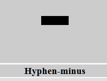
Unicode standardizes the representation of characters. Characters are abstractions of letters, numbers and symbols and are independent of how they will be visualize. Thus the text string C-2 consists of 3 characters ‘c’, ‘hyphen-minus’ and ‘two’ . Here is typical language from http://en.wikipedia.org/wiki/Hyphen-minus
The hyphen-minus (–) is a character used in digital documents and computing to represent a hyphen (‐) or a minus sign (−).[1] It is present in Unicode as code point U+002D – hyphen-minus; it is also in ASCII with the same value.
Almost all characters are representable by a glyph; here’s a typical hyphen-minus:
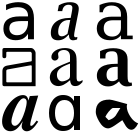
There is no standard glyph for a character and different computer fonts can have radically different glyphs (Douglas Hofstadter wrote considerably on the characters ‘A’ and ‘a’ and what was the essence of ‘a-ness’) http://en.wikipedia.org/wiki/A (Different glyphs of the lower case letter A.)
THE CONSUMER OF PDF2SVG SHOULD NOT HAVE TO CARE ABOUT GLYPHS
Java and HTML solved the problem by using Unicode for the character encoding and UTF-8 for the bytestream (http://en.wikipedia.org/wiki/UTF-8 ):
UTF-8 (UCS Transformation Format—8-bit[1]) is a variable-width encoding that can represent every character in the Unicode character set.
UTF-8 takes care of all the aspects of how a character is held in a machine or how many bytes are used when, where and in which order. In a properly constructed modern HTML/Java system the Unicode codepoint is all you need to know about. Both are based on Unicode. Both can and should be used with UTF-8.
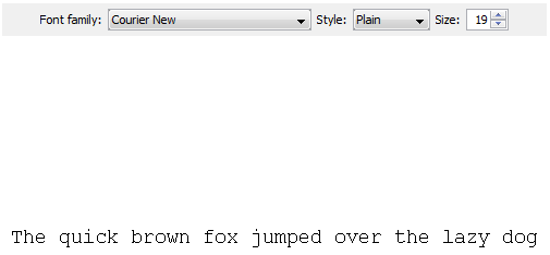
The beauty of HTML and Java is that they removed the need to transmit fonts and glyphs. They did this by requiring the implementer to provide a basic set of fonts. In Java these are http://docs.oracle.com/javase/tutorial/2d/text/fonts.html
There are two types of fonts: physical fonts and logical fonts. Physical fonts are the actual font libraries consisting of, for example, TrueType or PostScript Type 1 fonts. The physical fonts may be Time, Helvetica, Courier, or any number of other fonts, including international fonts. Logical fonts are the following five font families: Serif, SansSerif, Monospaced, Dialog, and DialogInput. These logical fonts are not actual font libraries. Instead, the logical font names are mapped to physical fonts by the Java runtime environment.
And
Physical fonts are the actual font libraries containing glyph data and tables to map from character sequences to glyph sequences, using a font technology such as TrueType or PostScript Type 1. Note: Applications should not assume that any particular physical font is present. However, the logical fonts are a safe choice because they are always present. See Logical Fonts for more information.
So Java has separated the problem of glyphs and fonts from the transmission of characters. You can get a feel with the applet in http://docs.oracle.com/javase/tutorial/2d/text/fonts.html#logical-fonts
Here’s a standard representation:
While we can change to, say, Helvetica and make it bold and italic.
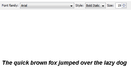
The point is that the CHARACTERS ARE THE SAME. See http://www.fileformat.info/info/unicode/char/54/index.htm for a comprehensive compilation of characters. Formally the sentence reads (name, Unicode point)
LATIN CAPITAL LETTER T (U+0054), LATIN SMALL LETTER H’ (U+0068) , LATIN SMALL LETTER E’ (U+0065)
If either of these representations is used there is no possibility of mistakes.
Java, therefore, allowed the programmer to forget about implementing Fonts and simply to concentrate on the characters. A letter ‘e’ is represented by U+0065 universally. (Although this is 0x0065 as a Java number this does not mean it has to be held in a single byte (and it probably isn’t) – early versions of Java did not support Unicode properly and many early String methods are deprecated. Also do not be confused by Java’s (char) and Character – think of this as a Unicode representation.)
The next bit of good news is that in 1998 W3C developed Scalable Vector Graphics. This is a well designed, relatively compact, language, that can do everything we need in STM publishing. It uses Unicode and can be transferred as UTF-8.
Between HTML(5) and SVG (and Java when required) we have a completely consistent, non-redundant way of representing any STM document.
That’s what AMI-PDF2SVG aims at. A final representation which is modern, interoperable, Open and runnable on every platform.
The problem is that STM publishers don’t use it as the primary output and use PDF. [AMI: no rants please].
Can PDF use Unicode? Yes, but most STM publishers choose not to use it. [… NO rants …]
This means that interpreting STM PDFs is a hundred times more complex than it might be. AMI has to be built to cope with the myriad of different Font Types, character sets and glyphs that are unstandardized. Here’s a typical problem:
Character in Unicode, charname=”two”, charCode=50 ; result: char(50) or ‘2’ in Java , normally interpreted as the digit 2
multiplication sign
Character in MathematicalPi-One, charname=”H11011″, charCode=1 ; result: Unknown
The problem is that MathematicalPi is not an Open standard. I can find nothing useful about it on the web: http://store1.adobe.com/cfusion/store/html/index.cfm?store=OLS-US&event=displayFont&code=MATH10005001 suggests that it is proprietaryAdobe and has to be bought. The next entry in a Google search is the Journal of Bacteriology: http://jb.asm.org/site/misc/journal-ita_ill.xhtml which says:
Fonts. To avoid font problems, set all type in one of the following fonts: Arial, Helvetica, Times Roman, European PI, Mathematical PI, or Symbol. Courier may be used but should be limited to nucleotide or amino acid sequences, where a nonproportional (monospace) font is required. All fonts other than these must be converted to paths (or outlines) in the application with which they were created.
So here is a learned society which could recommend authors to use Unicode, promoting the use of closed proprietary fonts and also turning characters (useful) into paths/glyphs (almost no use for non-humans). I suspect most other publishers do the same. So we have a clear indication of where the STM industry could standardize on Unicode and doesn’t.
So it’s this sort of variety, proprietary closed mess that AMI has to tackle. The main problems are:
- Use of non-unicode encodings for characters.
- Use of glyphs instead of characters
- Imprecison in naming fonts, choice of font types, etc.
There is no technical excuse for not using standard fonts and Unicode. PDF supports it.
This is the core of what AMI has to deal with. If she had to tackle all of it, it would be horrendous. Fortunately the Apache community has created PDFBox which takes away some of the low aspects. By using PDFBox we do not have to deal with:
- Byte stream encoding
- Interpretation of Postscript
- Denormalization of graphics transformations
AMI therefore gets PDFBox output as:
- Characters, with a Font, a charname, and a charcode
- OR characters as glyphs
- AND a steam of paths for the graphics
Here’s a typical (good) character:
<text font-weight=”bold” stroke=”#000000″ font-family=”TimesNRMT” svgx:fontName=”HGNJID+TimesNRMT-Bold” svgx:width=”604.0″ x=”56.51″ y=”27.994″ font-size=”14.0″>S</text>
The font announces that it is bold and that its family is TimesNRMT (TimesNewRoman) and so presumably Unicode. We know the size (14.0), the position on the page (x,y) and that it is character U+0052 (LATIN CAPITAL LETTER S). If all STM publishing were this good, AMI could go straight on the the next part.
But it isn’t
What’s fontName=”MGCOJK+AdvTT7c108665″. PMR has never heard of it. Is it Unicode?
Or if not is there a mapping of the codepoints to Unicode? Because unless we know, we have to guess. And if we guess we shall make mistakes.
*** The Adv fonts seem to be common in STM publishing. Can anyone enlighten us where they come from and whether they have open specifications?***
Could you post an image of some characters in this font and the PDF they originate in? This would help us people who don’t have access to those things to help you.
Thanks,
Yes, I shall try to do exactly this in the next post or two. I will try to magnify as much as possible. But actually a lot are simple replacements for known characters (e.g. H11002 looks like a minus sign and quacks like a minus sign (i.e. it makes sense as a minus sign)). A magnified glyph probably doesn’t give much extra info (given that I expect there is latitude in size, aspect ratio, position, etc.)
Having implemented some font support for PDFBox, it is my understanding that fontNames shouldn’t be used to judge about what’s “inside” them.
The fontName=MGCOJK+AdvTT7c108665 probably corresponds to some synthetic font object. The PDF specification makes it clear that when PDF documents are exported with “the smallest PDF file size possible” objective, then it is OK to perform the compacting of embedded font objects by leaving out unnecessary glyphs, by remapping character codes etc. For example, it is not too uncommon to encounter embedded font objects that contain only one or too glyphs.
The extent of the compacting of font objects depends on the scientific publisher. Some do it, some don’t.
Extremely useful. All help of this sort makes a great difference.
>>Having implemented some font support for PDFBox, it is my understanding that fontNames shouldn’t be used to judge about what’s “inside” them.
I agree. However the fontName is sometimes all there is
>>The fontName=MGCOJK+AdvTT7c108665 probably corresponds to some synthetic font object.
I was afraid of that. Each Advxxxxx is specific to that paper.
>>The PDF specification makes it clear that when PDF documents are exported with “the smallest PDF file size possible” objective, then it is OK to perform the compacting of embedded font objects by leaving out unnecessary glyphs, by remapping character codes etc. For example, it is not too uncommon to encounter embedded font objects that contain only one or too glyphs.
Understood. The message is that the publishers are exporting only the necessary glyphs.
>>The extent of the compacting of font objects depends on the scientific publisher. Some do it, some don’t.
Any information on how this happens and who does it would be really valuable.
I have a feeling that at the end I am going to come down to interpreting glyphs. I am prepared mentally for this, as it’s not really different from OCR – in fact it’s better as we have explicit paths. Could even be fun in a weird way. And useful for crowdsourcing
>> Any information on how this happens and who does it would be really valuable.
I’m afraid there’s no general pattern there. The compacting of embedded fonts is done using special software libraries/tools (something from Adobe’s portfolio?). Is there a way to download the same document both in “normal size” and in “compacted” variants, so that it would be possible to compare (“diff”) them in terms of embedded font objects?
I have reached a similar conclusion that OCR-like approach would be the most accurate/effective way of recovering text that is represented using embedded font objects. I wouldn’t go down the path of visual interpretation of glyphs (ie. bitmap OCR). Instead, I would try to create a “similary matrix” of glyphs (ie. classification of path fragments and ensembles). Assuming that the uncompacted parent of fontName=MGCOJK+AdvTT7c108665 is known it should be possible identify individual glyphs by full matches.
Thanks, very helpful
>>I’m afraid there’s no general pattern there. The compacting of embedded fonts is done using special software libraries/tools (something from Adobe’s portfolio?). Is there a way to download the same document both in “normal size” and in “compacted” variants, so that it would be possible to compare (“diff”) them in terms of embedded font objects?
I don’t know, but thanks for the idea.
>>I have reached a similar conclusion that OCR-like approach would be the most accurate/effective way of recovering text that is represented using embedded font objects. I wouldn’t go down the path of visual interpretation of glyphs (ie. bitmap OCR). Instead, I would try to create a “similary matrix” of glyphs (ie. classification of path fragments and ensembles). Assuming that the uncompacted parent of fontName=MGCOJK+AdvTT7c108665 is known it should be possible identify individual glyphs by full matches.
This is exactly what I am doing. Assuming the path can be extracted, then an “I” for example is MLLLZ or MLLLL. A “C” might be MLCCCLCCCZ where the curves are made of 3 beziers. Leaving aside Maths we only have about 300-400 common characters and it should be possible to find which is which. Also the fonts are simple.
However we will have to tackle “OCR” for diagrams and here well have to do something similar. It may be that we create 400 common bitmaps and overlay the unknown, adjusting for scale and character width. I’m reasonably optimistic. (Note that this only works easily for electronic documents. I am NOT going to process scanned paper or handwriting!!).
Villu is correct — you cannot ‘trust’ the names of fonts to mean anything. If you’re lucky they will have some words like ‘bold’ or ‘italic’ or end with ‘-b’ or ‘-i’. But they are just opaque identifiers, planted in there by whatever software created the document (typically Unix like stuff plants human-readable names, Microsoft stuff plants duff names, but you shouldn’t rely on them even if they look as though they mean something).
I appreciate you’re holding yourself back from repeating previous rants about the evils of PDF; but it is worth pointing out that all the things you blame PDF for are just as common in HTML, because these days they are both generated from a common source. The problem is that (STM) publishers abuse the encoding systems (for example using a ‘ndash’ or ‘mdash’ symbol where they mean a ‘minus’ because according to their in-house graphics designer it ‘looks a bit nicer’). Neither PDF nor HTML can prevent this from happening — if the underlying XML stipulates a particular character/glyph, then both the representations will end up with a ‘non semantic’ character. It’s not true that most PDFs don’t use unicode. It *is* true that they don’t use it well (but then, the same problem exists in the HTML and XML markup too).
Another example that’s particularly common (and annoying! in chemistry and biology papers is that the German eszett character ß (http://en.wikipedia.org/wiki/ß) is commonly used instead of the Greek letter Beta (β, http://en.wikipedia.org/wiki/Beta). Visually, in most typefaces they don’t look very different… semantically of course they have very different meanings.
You say beta, I say beta
You say ß, I say β.
ß
β
ß
β
Let’s call the whole thing off.
Incidentally, we have tackled some (but not all) of the problems you mention here (and many more, that you’ll encounter as you try to dehamburger content, whether in HTML or PDFs) at
http://pdfx.cs.man.ac.uk
First, many thanks for your comment – I’ll reply per para.
Just to say that Utopia seems a nice piece of software, and also for the offer of using your web-service which I haven’t done in the past as I didn’t have the need. But if you are happy for me to use it, and publish comparisons, I will be happy to try to play fair.
I don’t feel in competition with Utopia as we have different goals. I don’t quite know what yours are but mine are – I hope – clear:
To build an Open set of content-mining resources. We are starting to do this on OKF open-science
To create a community of practice and gather resources
to challenge the current technical practice of scholarly publication and to create a better way
to add semantics to scientific communication.
That does not preclude closed tools such as Utopia. We have shown that in chemistry we can build Open Source tools which are the equal of closed tools and which are then frequently integrated into commercial applications. We are quite happy with this (except when they pretend they wrote them). I suspect that same has to happen in content-mining.
Note “content-mining”. I am not restricting this to text.
>>Villu is correct — you cannot ‘trust’ the names of fonts to mean anything. If you’re lucky they will have some words like ‘bold’ or ‘italic’ or end with ‘-b’ or ‘-i’. But they are just opaque identifiers, planted in there by whatever software created the document (typically Unix like stuff plants human-readable names, Microsoft stuff plants duff names, but you shouldn’t rely on them even if they look as though they mean something).
I agree. I had hoped for, but not expected, any systematics. It’s not necessary.
>>I appreciate you’re holding yourself back from repeating previous rants about the evils of PDF; but it is worth pointing out that all the things you blame PDF for are just as common in HTML, because these days they are both generated from a common source.
I doubt this. Yes, it’s possible to corrupt HTML but with proper encoding it is less likely.
>>The problem is that (STM) publishers abuse the encoding systems (for example using a ‘ndash’ or ‘mdash’ symbol where they mean a ‘minus’ because according to their in-house graphics designer it ‘looks a bit nicer’). Neither PDF nor HTML can prevent this from happening — if the underlying XML stipulates a particular character/glyph, then both the representations will end up with a ‘non semantic’ character.
I am fully aware of this and generally resolve it through linguistic and semantic analysis. I never trust characters whose glyphs resemble others. But this is a slightly different problem from not knowing what the original character was. Here you know, but the wrong one was chosen.
>>It’s not true that most PDFs don’t use unicode. It *is* true that they don’t use it well (but then, the same problem exists in the HTML and XML markup too).
The problem is to know where they aren’t using it. Again I have strategies.
>>Another example that’s particularly common (and annoying! in chemistry and biology papers is that the German eszett character ß (http://en.wikipedia.org/wiki/ß) is commonly used instead of the Greek letter Beta (β, http://en.wikipedia.org/wiki/Beta). Visually, in most typefaces they don’t look very different… semantically of course they have very different meanings.
>>You say beta, I say beta
>>You say ß, I say β.
ß
β
ß
β
Let’s call the whole thing off.
At this stage I don’t do German. It’s not common in modern STM pubs and this is a minor problem which heuristics can resolve.
>>Incidentally, we have tackled some (but not all) of the problems you mention here (and many more, that you’ll encounter as you try to dehamburger content, whether in HTML or PDFs) at
>>http://pdfx.cs.man.ac.uk
Thanks for the offer of the service. I shall use it occasionally. Incidentally for the first paper I tried it flattened all the superscripts, such as :
(68 μg mL −1 )
So far my approach copes with most superscripts I have come across. They aren’t trivial, but I can get reasonable numbers out of them.
Cheers,
P.
[You succeeding HTML example is rather artificial, I think :-). What’s a more common problem is graph axes which are upside down due to landscaping of vertical axes.]
˙ǝsnqɐ ɹǝʇɔɐɹɐɥɔ oʇ ǝlqɐɹǝulnʌ sɐ ʇsnɾ sı lɯʇɥ ‘ʇuıod ɐ ǝʞɐɯ oʇ ‘oslɐ
>> First, many thanks for your comment – I’ll reply per para.
>> Just to say that Utopia seems a nice piece of software, and also for the offer of using your web-service which I haven’t done in the past as I didn’t have the need. But if you are happy for me to use it, and publish comparisons, I will be happy to try to play fair.
>> I don’t feel in competition with Utopia as we have different goals. I don’t quite know what yours are but mine are – I hope – clear:
Thanks. I don’t think there’s any conflicts here either.
The point I’m trying to make is that the mess we see in PDFs (and HTML) representation is caused by a combination of a lack of sensible authoring tools, and the process of ‘publishing’; sometimes authors do things right, and publishers mangle them; sometimes the other way round, and the mistakes appear in all representations (even in the XML versions of things).
There is one place where PDF is considerably worse than HTML, and that’s in the very naughty use publishers sometimes make of combining glyphs to make characters ‘look right’. I’ve found instances where the Å (Angstrom) symbol is created in the PDF by drawing a capital A, and then a lower-case ‘o’, with instructions to shrink the o, move it back one character, and place it above the A. In the PDF this looks OK to a human, but comes out as guff to a machine (again, a heuristic needed to spot it). In this particular instance the HTML representation was also broken, coming out as two sequential characters ‘Ao’. And all this in spite of the fact that there’s a perfectly good unicode Å character.
The ß versus β problem is surprisingly common (though as you say, its relatively rare that ß would appear in STM articles to mean the German character) — we’ve found several instances of it in modern articles — again unless you’re analysing these things with a machine, they look plausible in both PDF and HTML, and its only an eagle-eyed reader that would spot them.
Perhaps it would be useful for us to jointly create a list of dodgy characters / naughty encodings and heuristics for spotting them?
> Thanks for the offer of the service. I shall use it occasionally. Incidentally for the first paper I tried it flattened all the superscripts
Yes, I’m not surprised. It focuses on getting the gross structure of an article right at the moment, rather than on the things that are important to your task.
> [You succeeding HTML example is rather artificial, I think . What’s a more common problem is graph axes which are upside down due to landscaping of vertical axes.]
Absolutely, utterly artificial 🙂
I note that in Physics, where authors typically use LaTeX to write their scripts, these problems are less common than in biology and chemistry because papers are typically born slightly more ‘semantic’ than elsewhere (i.e. you write \Beta, so are less likely to accidentally select eszett by mistake).
I wonder whether there’s scope for a tool that tries to spot such errors early on; something that could be used by both publishers and authors regardless of what system they used to write their source? A kind of Scholarly/Scientific Lint? (http://en.wikipedia.org/wiki/Lint_(software))
Best wishes
Steve
>>The point I’m trying to make is that the mess we see in PDFs (and HTML) representation is caused by a combination of a lack of sensible authoring tools, and the process of ‘publishing’; sometimes authors do things right, and publishers mangle them; sometimes the other way round, and the mistakes appear in all representations (even in the XML versions of things).
The main problem is that many publishers don’t care. Some, like IUCr produce EXCELLENT semantic pubs. They work with the authors so the papers are a delight.
Most others aren’t. I am not attributing motives – I’ll let readers do that. But the products are frequently really awful. Publishers are publicly saying “we don’t care about accurate scientific communication”. Fine, they will become marginalised. And they have given up any right – other than force of lawyers and timidity of librarians – to suggest they should receive any money for managing data.
>>There is one place where PDF is considerably worse than HTML, and that’s in the very naughty use publishers sometimes make of combining glyphs to make characters ‘look right’. I’ve found instances where the Å (Angstrom) symbol is created in the PDF by drawing a capital A, and then a lower-case ‘o’, with instructions to shrink the o, move it back one character, and place it above the A. In the PDF this looks OK to a human, but comes out as guff to a machine (again, a heuristic needed to spot it). In this particular instance the HTML representation was also broken, coming out as two sequential characters ‘Ao’. And all this in spite of the fact that there’s a perfectly good unicode Å character.
Indeed, And I’ve encountered it. I don’t think it’s very common. I repeat I haven’t yet started to interpret maths. But I do do chemistry and so I am aware that I can mean Iodine or roman I, II never means Iodine but always roman II, so I can be interpreted by context.
>>The ß versus β problem is surprisingly common (though as you say, its relatively rare that ß would appear in STM articles to mean the German character) — we’ve found several instances of it in modern articles — again unless you’re analysing these things with a machine, they look plausible in both PDF and HTML, and its only an eagle-eyed reader that would spot them.
Sure, But if the language is English, then it has to be a beta. If it’s german then I suspect very few german words end with a beta – even TGF-beta has a dash/minus. Context will cure most of these.
>>Perhaps it would be useful for us to jointly create a list of dodgy characters / naughty encodings and heuristics for spotting them?
Great idea. And also a list of the publishers who are worst offenders.
> Thanks for the offer of the service. I shall use it occasionally. Incidentally for the first paper I tried it flattened all the superscripts
>>Yes, I’m not surprised. It focuses on getting the gross structure of an article right at the moment, rather than on the things that are important to your task.
Understood. I have to get superscripts right.
>>I note that in Physics, where authors typically use LaTeX to write their scripts, these problems are less common than in biology and chemistry because papers are typically born slightly more ‘semantic’ than elsewhere (i.e. you write \Beta, so are less likely to accidentally select eszett by mistake).
LaTeX is almost semantic. A few heuristics allow it to be parsed into XML. And even the flattened text retains traces.
>>I wonder whether there’s scope for a tool that tries to spot such errors early on; something that could be used by both publishers and authors regardless of what system they used to write their source? A kind of Scholarly/Scientific Lint? (http://en.wikipedia.org/wiki/Lint_(software))
Yes. That’s what the second and third phases of AMI2 will concentrate on.
Pingback: Unilever Centre for Molecular Informatics, Cambridge - #ami2 #opencontentmining; Introducing AMI, and introducing AMI to publisher’s PDFs « petermr's blog