Now that I am working with Ross Mounce on phylogenetic trees and related sciences I have to learn about what some of the diagrams mean. This is the first in hopefully a series of posts
Here’s a diagram from BMC Evolutionary Biology http://www.biomedcentral.com/content/pdf/1471-2148-12-26.pdf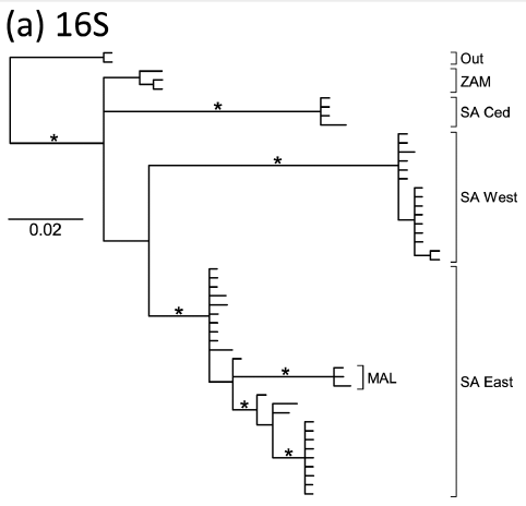
And here’s one from from Molecular Phylogenetics and Evolution
http://www.sciencedirect.com/science/article/pii/S1055790311005203

So what is the main difference between them? I’d welcome reader’s comments.
UPDATE:
A number of people have commented that they cannot see the second image. This is very common. There is a simple, clear explanation. No-one has fully explained why yet.
Well, for a start, the first one looks like a diagram and the second is just a white rectangle. At least in the three browsers I have (Safari, Chrome and FF, on a Mac).
I’m getting the same as Jan…
One is legally redistributable and the other isn’t?
“A number of people have commented that they cannot see the second image. This is very common. There is a simple, clear explanation.”
Assuming that this isn’t some sort of clever “post modern” reading of the text question – then is the answer that the sciencedirect image is a .sml file?
I’m one of your #scholarlypoor without access to the full text article but the graphic abstract for Fig 2 (which seems to be a phylogenetic tree) has the property http://ars.els-cdn.com/content/image/1-s2.0-S1055790311005203-gr2.sml
Googling up .sml gives me “Audiovisual presentation created in the Synchronized Multimedia Integration Language (SMIL), which was developed by the Synchronized Multimedia (SYMM) Working Group; contains markup code similar to HTML as well as text and references to streaming audio and video files; used to store choreographed presentations.”
Has someone clipped out a slide from a “powerpoint” show and slipped it into the article?
A png file, an image containing a dot. No idea what it means.
The answers are getting closer. I’ll reply in a few hours. For today I am also a #scholarlypoor.
Disregard my first post. .sml file etc red herring. This is a PMR “post modern”. The box is blank, empty -period,end of. Rather like the “Invisible Art” exhibition running at moment in London(?). Why empty? Simple – Elsevier (Sciencedirect) have blocked copying of the graphic in the article. Or allowed a “copy blocked” graphics image to be inserted without checking/altering its properties. But they wouldn’t block graphics copying as a policy would they? I mean, what are the implications for content mining etc. Pity that as one of the scholarly poor I have to shell out $39.95 to test my hypothesis – and I’m not feeling that generous to Elsevier.
Well Done Pete!
The box is nothing to do with the image. Note that my mail said nothing about the box. I REFERRED to the image. The image is safely behind Elsevier’s paywall. Today I cannot penetrate that so I cannot see it.
What you can see is the result of Elsevier’s UNIVERSAL ACCESS policy. The white box is symbolic of that.
Note that I am forbidden to reproduce the image in any form. And I am law-abiding so I am abiding by UNIVERSAL ACCESS.
The good thing about UNIVERSAL ACCESS is that it has no constraints imposed by nature or science (lowercase). Therefore you are able to imbue it with anything you like.
UNIVERSAL ACCESS inspires the same freedom and love as Orwell’s MINISTRY of TRUTH.
In the end Winston Smith came to love BIG BROTHER. In the end I shall come to love Elsevier’s UNIVERSAL ACCESS…
It’s so much easier to give in and stop fighting…
“It’s so much easier to give in and stop fighting…” Oh no, you won’t!
So, it’s not a technical issue (Elsevier have put a copy block on the graphics), but a copyright issue. Though I guess they would justify a technical copy block – to save us from ourselves. OK, go back to the Hargreaves Review and look at the government proposal for extending the right of “quotation” http://www.ipo.gov.uk/consult-2011-copyright.doc sec 7.178 et sec and note, in particular ref 77.
77.“Quotations” are understood to include extracts of works in general, and not only quotations of literary works.
I think, but am not sure (not a lawyer etc..), that extension of this quotation exception to include use for information, analysis etc (see sec 7.193)could allow researchers to quote graphics from articles. I think I know who might be able to give you a better answer. Professor Lionel Bently of Cambridge University submitted to the Hargreaves Review a powerful argument for extension of the quotation exception. Of course, this proposed quotation exception is just that at present, a proposal. Therefore, still needs lobbying for from the side of the scientific community, as you can be sure that from the other side the lobbying will still be going on to lock it down as tightly as possible.
It may not meet your larger objective, but would not ‘fair-use’ allow you to re-use the image (with attribution) at least under some circumstances?
Sorry Walter!
“fair-use” only relates to US law and is poorly defined there. Lessig has defined it as the right to call a lawyer to defend you.
As an example Shelley Batts published one graph on her blog making a very valid scientific point and Wiley sent the lawyers after her. The blogosphere erupted, Wiley backed down but they haven’t said they won’t do it again and I am sure they are still paying the lawyers.
And UNIVERSAL ACCESS has many lawyers.
Pingback: Content mining for phylogenetic data - Ross Mounce