In previous posts I have shown how we can, in most cases, create a set of Unicode characters from a PDF. If the original authors (e.g. many Government documents) were standard-compliant this is almost trivial. For scholarly publications, where the taxpayer/student pays 5000 USD per paper, the publishers refuse to use standards. So we have to use heuristics on this awful mess. (I have not yet found a scholarly publisher which is compliant and makes a syntactically manageable PDF – we pay them and they corrupt the information). But we have enough experience that for a given publisher we are correct 99->99.999% of the time (depending on the discipline – maths is harder than narrative text).
So now we have pages and on each page we have an UNORDERED list of characters. (We cannot rely on the order in which characters are transmitted – I spent two “wasted” months trying to use sequences and character groupings). We have to reconstruct text from the following STANDARD information for each character:
- Its XY coordinates (raw PDF uses complex coordinates, PDFBox normalises to the page (0-600, 0-800))
- Its FontFamily (e.g. Helvetica). This is because semantics are often conveyed by Fonts – monospace implies code or data. (I shall upset typographical purists as I should use “typeface” (http://en.wikipedia.org/wiki/Typeface ) and not “font” or “font family”. But “FontFamily” is universal in PDF and computer terminology.
- Its colour. This can be moderately complex – a character has an outline (stroke) and body (fill) and there are alpha overlays, transparency, etc. But most of the time it’s black.
- Its font Weight. Normal or Bold. It’s complicated when publishers use fonts like MediumBold (greyish)
-
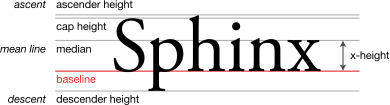
Its Size. The size is the actual font-size in pixels and not necessarily the points as in http://en.wikipedia.org/wiki/Point_%28typography%29 .
Characters in the same font have different extents because of ascenders and descenders:
-
Its width. Monospaced fonts (http://en.wikipedia.org/wiki/Monospaced_font ) have equal width for all characters:
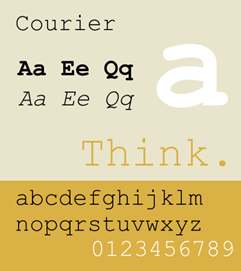
Note that “I” and “m” have the same width. Any deliberate spaces also have the same width. That makes it easy to create words. The example above would have words “Aa”, “Ee”, “Qd”. (A word here is better described as a space-separated token, but “word” is simpler. It doesn’t mean it makes linguistic or numeric sense.
If the font is not monospaced then we need to know the width. Here’s a proportional font (http://en.wikipedia.org/wiki/Typeface#Proportion ):
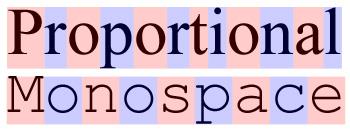
See how the “P” is twice as wide as the “I” or “l” in the proportional font. We MUST know the width to work out whether there is a space after it. Because there are NO SPACES in PDFs.
- Its style. Conflated with “slope”. Most scientists simply think “italic” (as in Java). But we find “oblique” and “underline” and many others. We need to project these to “italic” and “underline” as these have semantics.
Note that NormalBold , Normal|Italic, Normal|Underline can be multiplied to give 8 variants. Conformant PDF makes this easy – PDFBox has an API which includes:
- public float getItalicAngle()
- public float getUnderlineThickness();
- public float getItalicAngle()
- public
static
boolean isBold(Font font)
If we have all this information then it isn’t too difficult to reconstruct:
- words
- Weight of words (bold)
- Style of word (italic or underline)
Which already takes us a long way.
Do scholarly publishers use this standard?
NO
(You probably guessed this.) For example I cannot get the character width out of ELife, the new Wellcome/MPI/HHMI journal. This seems to be because ELife hasn’t implemented the standard. They launched in 2012. There is no excuse for a modern publisher not being standards-compliant.
So the last posts have shown non-compliance in Elife, PeerJ, BMC. Oh, and PLoSOne also uses opaque fontFamilies (e.g. AdvP49811) . So the Open Access publishers all use non-standard fonts.
Do you assume that because closed access publishers charge more, they do better?
I can’t answer that because they have more money to pay lawyers.
I’ll let you guess. Since #AMI2 is Open Source you can do it yourself.