Dictated to Arcturus (my computer)
I had a wonderful comment on one of my recent posts
 book publishers says:
What a beautiful map of living systems, reminds me of a maze – thanks for the links
I went to their webpage and found an example of a medieval illustrated manuscript. Since it is probably copyright I am including a similar example from Wikipedia.
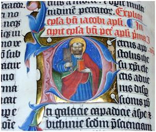
Documents such as this are held in awe by our culture. We marvel at the effort that the monks put in. People will visit the British library and similar museums simply to wonder. But others will shake their head and say how much more efficiently it could be done using the printing press.
What will people in a hundred years’ time think of the documents that we produce? Will they look at the typical PDFs produced by the scholarly publishers and marvel at their beauty. Or will they shake their heads at the futility of trying to continue the printed tradition in the electronic information? Will they ask “why did they not use machines to organize their information?” Why did they not try to make machine-readable information? I do not know what historians will say but I hope that some of them will point out that this is a tragic backwater where commercial and economic interests briefly held sway over the principle of making semantic information available to everyone.
Creating high quality non textual information is not easy to the biochemical pathway that I showed in the last post will have taken many years to produce. Here’s a transcluded example (I link but do not copy – do I break copyright? Does it matter?) Biochemical pathways
http://www.flickr.com/photos/ejain/367998451/
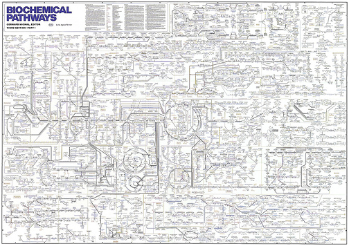
The collection of the scientific data will have taken millions of cumulative years but laying out the information in a way that humans can understand has also taken years – probably tens of years. This is because it is not immediately clear from the science what components are related to what. Some relationships bridge areas that are formally unrelated. (In essence a feedstock created for one purpose is used in a completely different context). But the problem is that the diagram above is too complicated for humans to understand completely.
Here is an example (http://en.wikipedia.org/wiki/Biochemical_pathways ) of the same information when the components are simplified. (It’s not laid out precisely with the same coordinates, but the major topological features can be recognised even if you don’t understand biochemistry. Look for the cycles and spirals.)
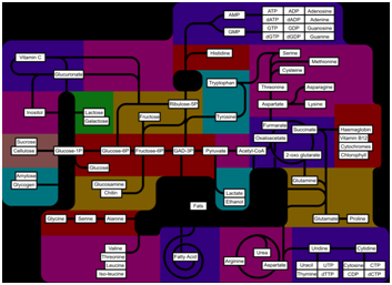
In the Wikipedia article all the subsystems are hyperlinked so that the reader (human or machine) can reach them. Hyperlinking is one of the major revolutions in communication (though we are still very poor at it, especially for machines) and chained in the dungeon of publishing when it comes to freedom to access and use.
But part of the skill is to create documents with a reduced amount of visual components that carry a as much message as possible. That is a real skill which is desperately needed in the machine age. It’s relatively easy to create huge networks. It’s extremely difficult to show the critical essence.
Could a machine ever have the skill to extract the essence from networks and visualize it?
I think the answer is “occasionally”. Doing it consistently is the essence of the challenge of the Semantic Web.
I have tried to dictate this but things got on top of me. I and Arcturus are learning.
Pingback: Twitter Trackbacks for Unilever Centre for Molecular Informatics, Cambridge - Scientific information is beautiful « petermr’s blog [cam.ac.uk] on Topsy.com