Ross Mounce and I are starting to extract content (“content-mining”) from BMC journals. [Why BMC only? Because most of the other major publishers refuse to let us do it even when we subscribe.] [Why not PLoS? For technical informatics reasons which I have communicated to PLoS and which they have taken on board.]
I am going to appeal frequently for like-minded people to form a community of Open Content Miners, so if you are interested, let us know.
Anyway we are going through BMC Evolutionary Biology and looking at data types. We are optimistic in general.
DISCLAIMER: I shall use examples from BMC because this is all I can access. I shall frequently be critical – BMC is no better or worse in most of these. My criticism of Elsevier, Wiley, Springer, Nature, RSC, ACS, etc. is an order of magnitude worse.
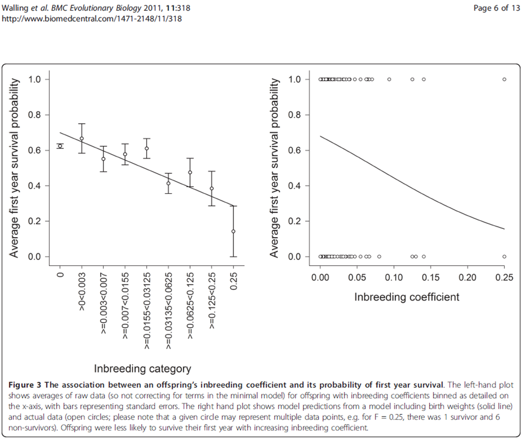
Anyway – here’s the first diagram I came across. I’ll say later HOW we extract, but for the moment look how badly the information is presented. That’s partly because of the slavery of the printed page (and “print” is the evil word because authors and publishers expect reader to print the page). Tell ME what you think is suboptimal about this figure (I have at least 3 complaints, some of which are very common). The diagram should scale to a size where the text is (just) readable.
UPDATE:
People have been reading this – I’d value your comments.
The things which stand out to me are the overlapping of ‘points’ in the right hand graph, and that the left hand graph should really be a histogram for easier comprehension of ‘binned’ data. One also feels that the graphs should start at the origin, rather than what is seen here which is probably a decision made for aesthetic purposes (though how that impacts upon data mining I wouldn’t be certain.)
Many thanks Phil,
(It’s really helpful to have people comment)
Yes – the overlapping of points could trivially solved – saying “our plot is flawed” doesn’t help (though without it there are even worse errors). Either make the circles reflect the number of points or jitter them of anything. And a model where the only values are 0/1 is not best modelled by a continuous graph.
I agree about the origin – you have to do a double-take to realise a point or line has a zero value.
My main problem with the LH x-axis is that it’s unreadable. First it’s on its side, and then (as you say) they are bins. The scale is (almost) exactly logarithmic, so they should say so and use simple values. Most people can manage: 0.003/0.007/0.015/0.03/0.06/0.125/0.25 without problems – they’ve seen logarithmic scales.
But it’s worse. It looks like a regression against “inbreeding category”. But this is described as “inbreeding coefficient” in the caption. Are they synonyms? Or sloppiness? And the line – if it has any value in a histogram – would then be against LOG(IC).
I have not read the wider text and it may be clarified there but it doesn’t score high marks on the Tufte scale.